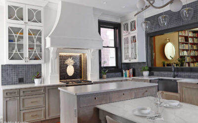
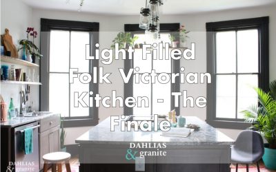
The Build: What It Actually Takes to Renovate a 1911 Kitchen
There is a version of a kitchen renovation that exists in renderings — clean lines, finishes selected, everything in its place. And then there is the version that exists before that one, where the walls are open and the floors are covered in a century’s worth of decisions that have to be undone before anything new can begin.
This is that post.
The dust
The wood paneling came off first, then the plaster and lath walls. Plaster dust is some of the finest particulate you will ever encounter in a renovation — it travels. It doesn’t stay in the room you’re working in. It finds its way into every other room, settles on every surface, and coats everything in a layer that feels almost silky until you realize it’s been three days and it’s still there.
The drywallers came in after demo. Drywall sanding dust is similarly fine, though it doesn’t travel quite as aggressively. And then came the floors.
Floor sanding dust is in a category of its own. It lands on exposed skin and pulls the moisture out of it. Face masks needed to be changed nearly every hour. A shop vac handles what it can, but the dust wins most of the time. Anyone who tells you a renovation is clean has never opened up a 110-year-old house.
What was inside the walls
Once the walls were open, the first thing that became visible was knob and tube wiring — the original electrical system, still in place throughout the house. It had been spliced into both aluminum wire and copper romex, which is among the more hazardous combinations you can find in an old home. The decision was straightforward: full rewire, the entire house, not just the kitchen.
The electricians were in the house for three weeks on the rough-in alone. Some of the kitchen wiring had to wait until after the cabinets were installed.
The HVAC was a separate project entirely. This house got a full mini-split system — individual head units in each room, fed by copper line sets running from outdoor condensing units. Installing line sets through a 1911 house means feeding two insulated copper pipes, an electrical wire, and a condensate drain line through walls built with old-growth lumber used as studs — dense, massive, and not interested in cooperating. Eight line sets total, four running through the kitchen walls.
My dad came down to help run them — four of us working simultaneously across three floors, my husband in
the crawlspace feeding lines up through the floor, our neighbour on the second floor passing them up, and my dad pulling them into the attic while I worked the main floor. We spent most of the time shouting to each other through walls thick enough to swallow the sound.
Here is a short video of me feeding a line set through a wall. It was three seconds long, but I slowed it down to show 10 seconds.
There was also a happy surprise. When the walls opened up above the fireplace mantel, the original brick was there — intact, just waiting. It stayed exposed. It’s still there.
The floors
The floors are original heart pine — old-growth, dense, narrow-grained, the kind of wood that doesn’t exist in new construction anymore. They were also cupped, which is what happens to old wood floors over time as moisture works through them unevenly, and they had adhesive from a previous surface bonded directly to them.
Getting them back meant sanding by hand — my husband, my brother, a neighbour, and me, working through the glue room by room. Heart pine at this age responds differently than newer wood — it has to be read as you go. The result was worth every hour of it. Refinished, the floors became the anchor of the room.
The trim
When the original trim came off during demo, most of it came apart in pieces. Some was salvageable. Most wasn’t. The millwork in this house — the entryway, the living room, the study — is part of what makes it what it is, and matching it convincingly matters.
A specialty wood shop had a knife profile already cut that was close enough to the original that it’s genuinely difficult to tell them apart. The new trim went in alongside what could be saved, and the room reads as continuous. That’s the goal — not perfect preservation, but seamless integration.
The finishes
The cabinet color went through its own process. White cabinets are beautiful in principle — and impractical in a kitchen where two people cook seriously and messes are part of the work. The cabinet makers produced samples based on a reference image, landing on a stain and glaze that reads somewhere between driftwood and warm grey. Neither painted nor natural. A tone that felt like it had always been in the home.
The sink configuration was a 60/40 over a standard 50/50 — larger and deeper on the main side, sized to lay a full plate flat. For a kitchen where preserving is part of the work, that matters.
The granite slab was selected in person at the supplier, which is the only way to choose stone. A slab that reads as grey and white in a sample board has movement and depth in full scale — it shifts with the light. In a kitchen with three bay windows, that’s not a small thing. The right slab was identifiable the moment I saw it. I called the supplier from the cabinet maker’s studio and asked her to hold it.
I made the floating shelves from raw ash slab — cut, sanded through multiple grits, sealed, and installed on hidden brackets myself. The kind of detail that reads as simple once it’s done, and is anything but.
Studio Olio specializes in historic home renovation in Denver and remotely. If you’re planning a kitchen renovation and want to understand what’s possible — start with a complimentary discovery call.
What should you do if you find knob and tube wiring during a historic home renovation?
It depends on the condition. Knob and tube that is unspliced and has intact insulation can, in some circumstances, be left in place — it’s the modifications that make it dangerous. In this house, the wiring had been spliced into both aluminum wire and copper romex, which is among the more hazardous combinations you can find in an old home. That made the decision straightforward: full house rewire, not just the kitchen. If the walls are already open and the wiring has been compromised, there’s no good argument for leaving it.
Can original hardwood floors be saved if they have glue or adhesive on them?
Usually yes, though it takes more work than a standard refinish. Old-growth hardwoods like heart pine are dense enough to sand through most adhesives, but cupping and uneven surfaces require reading the floor as you go rather than running a drum sander straight through. The result is nearly always worth the effort.
How do you match original trim in a historic home renovation?
Find a specialty millwork shop that can match the profile. Most historic trim was cut with specific knife profiles that a good shop can replicate from a sample of the original — or from a measurement if the original is too damaged. The goal is seamless integration, not a perfect copy of something that no longer exists.
How do you manage dust during a historic home renovation?
You manage it, but you don’t eliminate it. Plaster, drywall, and floor sanding each produce different dust with different behavior — plaster travels the farthest, floor sanding is the most physically demanding to work through. An air scrubber is worth having on site — unlike a regular fan, it pulls particulates through a HEPA filter rather than just redistributing them. Containment helps. A shop vac helps. Changing your face mask regularly helps. Accepting that everything will be coated in something fine and gritty for the duration of the project helps most of all.
Before anything gets built, there’s a period where the room exists only on paper — and the job is to find the layout that stops arguing with itself.
For this kitchen, that took five iterations before I got to two concepts worth presenting. A room with three bay windows, two single doors, a set of French doors, an original built-in, and a fireplace requires that kind of rigor. Every opening is a constraint, and constraints in a room like this compound quickly.
What the constraints were
The room is 14 by 15 feet at its widest point — generous for a Victorian kitchen, which is part of why it was the right room. But the five openings ate into that generosity fast. Every door, every window, every built-in created a zone you couldn’t put cabinetry in front of. The fireplace took a full wall section. The French doors to the living room needed clearance on both sides.
What was left, once you accounted for all of it, was two functional walls. The constraints didn’t feel like limitations once I stopped working against them — they clarified the decisions, because they eliminated most of the options.
What got decided and why
The sink wall went between the two single doors — the only run long enough to hold it. Open shelving above rather than upper cabinets, because upper cabinets in a room with this much light and this many original details would have competed with what was already there. I built the shelves from ash slab — cut, sanded, sealed, and installed on hidden brackets.
The island went in the center of the room with the cooktop built in. The orientation was deliberate: sitting at either end of the island, the bay windows are directly behind you — the light, the greenery, the shelf of plants. The island had to be shortened from the original plan — the flow from the living room to the refrigerator required it, which is something you confirm by taping the layout on the actual floor and walking every path before anything gets built.
No upper cabinets anywhere in the room. The bay windows needed a plant shelf, not cabinetry. The built-in painted black, with the botanical wallpaper — black ground, gold branches — running the full wall on either side. That wall didn’t need anything else.
The built-in
The original built-in stayed exactly where it was. The passthrough behind its doors still connects to the butler’s pantry, exactly as it was designed to do a hundred years ago. Finishes like the wallpaper are confirmed on site, once the bones are in place and the room’s character becomes clear — not on a mood board. In a historic home, the room usually tells you what it needs. This one was no different.
What a layout actually is
A floor plan is the result of knowing — knowing how people move through a kitchen, how light shifts through the day, how a room with this many constraints wants to be organized. The iterations aren’t guesswork. They’re a process of elimination that only works if you understand what you’re eliminating and why. By the time a layout gets built, the decisions have already been made. The construction just makes them permanent.
In this kitchen, the layout that worked wasn’t the most obvious one — it was the one that listened to what the room already was. Five openings, a fireplace, a built-in with a century of logic behind it. The room was already telling you what it needed. The job was to stop proposing alternatives and start paying attention.
Studio Olio specializes in historic home renovation in Denver and remotely. If you’re planning a kitchen renovation and want to understand what’s possible — start with a complimentary discovery call.
Should I keep the original built-ins in a historic home?
Almost always yes. Original millwork is the hardest thing to replicate convincingly. Removing it saves almost nothing and costs the home something it can’t get back.
What do you do when a historic room has too many openings for a functional layout?
You work with what the room gives you. In this kitchen, five openings left two usable walls — that determined everything: where the sink went, where the island went, why there are no upper cabinets. Constraints in old homes are usually solvable once you stop fighting them.
Why avoid upper cabinets in a historic kitchen renovation?
Upper cabinets work well in kitchens that need visual weight or additional storage. In a room with original millwork, significant window area, or strong architectural details, they often compete with what’s already there. Open shelving keeps the room breathing and lets the bones show.
Every contractor who walked through said the same thing. They were all wrong.
The first question every contractor asked when they walked through the home was the same: “How about we just put the kitchen where the old kitchen was?”
Every time, my answer was no.
The original kitchen was the smallest room in the home. One window. The main back entry — where you came in from the car, from the yard, from the world — opened directly into it. It was dark, it was cramped, and it sat at the back of a Folk Victorian built in 1911 that deserved better.
I knew where the kitchen needed to go the moment I walked into the room in the middle of the home.
The room that wanted to be a kitchen
Three large bay windows. Greenery outside. Light coming in that changes through the day and makes a room feel alive.
The room had almost certainly been the dining room at some point — there was a built-in passthrough directly from the walk-in pantry, which told you everything about how the home had originally been organized. Someone had understood this home once. The passthrough was staying.
There was also a fireplace. Original, like all of them in the home. Not working, but present — the kind of detail you don’t erase just because it’s inconvenient. It stayed.
And then there were the openings: three large bay windows, two single doors, and a set of French doors leading to the living room. Five openings in one room, plus a fireplace, plus a built-in. Every contractor who said no was looking at that and seeing a problem. I was looking at it and seeing a kitchen.
What made the original kitchen wrong
The size was wrong. One window in a home full of light is a waste. But neither of those was the real problem.
Victorian kitchens were never meant to be seen. They were back-of-house by design — separated from guests, separated from family rooms, tucked away from everything that constituted the presentation of the home. The kitchen was a workspace. It produced heat, smell, noise, and mess, and the entire floor plan was organized to keep all of that invisible.
The butler’s pantry was the pressure valve. It sat between the kitchen and the dining room and did several things at once: it staged meals before they were presented, stored china and silver and linens, and kept the chaos of the kitchen completely hidden from anyone sitting at the dining table. Food moved through it quietly, in an organized way, without the dining experience ever touching the work that produced it.
The back stairs did the same thing for movement. Whoever was running the household could move between floors without using the main staircase. Supplies went up, laundry came down, and the front of the home stayed calm. Two parallel systems: one for living, one for running the home. The layout wasn’t decorative. It was functional logic.
By the time I bought this home, the staff were long gone — but the bones remained. The butler’s pantry was still there, tucked under the rear staircase, with shelves on each side and a large window. The passthrough was still there, connecting it directly to the room that would become the kitchen. The rear staircase was still there, but it no longer worked for modern living.
Moving the kitchen corrected that. The old kitchen became what a back-entry room with a parking-side door actually wants to be: laundry, mud room, tool storage. The home didn’t lose a room. It gained two.
The decision
Moving a kitchen in a historic home means new plumbing, new electrical, new ventilation — all of it relocated, all of it permitted. Every contractor saw the cost and the complexity and suggested the path of least resistance.
But the path of least resistance would have left the smallest, darkest room in the home doing the heaviest daily work, while the room with three bay windows and an original fireplace sat there being something lesser. That’s not a renovation. That’s just moving furniture around inside a problem.
What it became
The island and the bay windows became the anchor of the room — the kind of place where you sit down with coffee and don’t leave. I could watch the birds out those windows for hours. The flow worked. The storage worked, especially once the butler’s pantry found its home under the second staircase — but that’s the next post.
This renovation made something clear to me that I haven’t stopped believing since: historic homes already know how they want to be organized. The logic is in the bones. The job isn’t to impose a new plan — it’s to find the one that was always there.
That’s why I do this work.
—
Studio Olio specializes in historic home renovation in Denver and remotely. If you’re planning a kitchen renovation and want to understand what’s possible — start with a complimentary discovery call.
Yes — though it means relocating plumbing, electrical, and ventilation, all permitted. The question isn’t whether it’s possible, it’s whether the original layout is actually serving the home. Often it isn’t.
Will moving a kitchen hurt the historic character of the home?
Not if it’s done with the original logic in mind. In this case, moving the kitchen restored the home closer to how it was meant to function — the back room returned to a service entry, the kitchen moved to where the light was.
How do I know if my kitchen is in the wrong room?
Start with how the room feels to use every day. If the entry, the light, or the flow feels wrong, it usually is. Most historic homes have a logic to them — sometimes the kitchen just ended up in the wrong place over time.
This week I want to talk about the cabinet drawers, making our full sized fridge work in our space as well how we are keeping our open shelving functional!
We started with a room that wasn’t ever a kitchen before.
It has three large (but low) bay windows filling one whole wall, a doorway leading to the front entrance, a fireplace, french doors leading into the living room and another doorway leading into the back mudroom/laundry that is beside the built in pantry.
It looked like this:
And ended like this:
First the cabinet layout:
We have three outlets on the island, one on each side (except the range side). I’m very happy with the placement of these. Don’t forget outlets on your island, and place one more than you think you’ll need. I’m going to upgrade the outlets to a colour that blends in more with the grey wood than the stark electrician white!
The island cabinets are different on each side. This cabinet layout (as shown in above photo) has two shallower drawers and 4 deeper drawers. One of the shallow drawers is my own personal ‘junk drawer’ and the other shallow drawer holds typical things you would find in a shared ‘everything’ drawer along with a few kitchen gadgets.
I used expanding bamboo drawer dividers and this allows us to customise each drawer.
This is one of the deeper drawers where we store our large dinner plates, our tiny food prep or sauce bowls plus a few bowls that don’t match the others!
On the other side of the island we have one shallow drawer, two deep drawers and a pullout garbage and recycling drawer. The bins pull out and it’s super easy to empty the recycling.
At the front of the island, on either side of the range there are two slim cabinets. The one to the left is a pull out spice drawer, and came with four shelves. I don’t keep my spices in the typical cylindrical jars, so I removed two shelves plus I really wanted to use this pull out to hide all of our spatulas and wooden spoons!
I use hooks with magnets to store our oven mitts and this great little pan scraper, that also works on the range top. Tools that have more than one function are amazing!
The other side we store cutting boards, baking pans, pizza paddles. I have some metal dividers that still need to be installed to keep them all separated.
On to the elephant in the room…..
The refrigerator.
Placing the fridge in this room was a challenge with all the doors, windows and the built ins.
My logical mind thought that we should get a counter depth fridge (they are shallower) so we could extend the island by 6″. My pragmatic husband weighed in and thought we should get the full sized fridge instead as we love to entertain and could fit more beer and appies! (Canadian for appetizer.)
In my initial design I had the fridge facing the front door because we were going to flip the way the doors opened into the living room. We ultimately decided not to go that route and had enough room that the fridge could face the window.
Looks like it fits really nicely right? It does, until you open the doors! And it didn’t quite make it through the reno unscathed, the bottom now has a couple of dents!
We knew that the door on the left would not fully extend while the fridge is pushed back into place. The photo above shows how far each door opens. The right side is the full extension.
I haven’t found this to be much of a constraint on how we use and clean the fridge, but this could be a no go with some clients. Our tradeoff is we have ample room for entertaining and storing foods.
Keeping the counter and open shelves functional
Here is the styled shot you saw earlier in this post:
Here is how my counters look today. I used items I really do use everyday to style the shots. The copper compost bin was in front of the acacia wood lazy susan that you see here.
I like, erm need, items to feel neat and organised. I can’t stand coming down to the kitchen and seeing a mess. Having all the items we use everyday on the lazy susan, keeps everything accessible to both of us while working on opposite sides of the island. The huge bonus — the lazy susan keeps everything orderly for me!
After styling the lower shelf, I decided I loved having the two books on the lower shelf. They are the “Flavor Thesaurus” and “Kitchen Hacks”. Beside them are two canisters that hold flour and sugar.
The only thing that I changed on the lower shelf is removing the blue sorbet bowls and giving the black bowls their own place. We use the plates, glasses and measuring cups nearly every day.
On the counter we have our instant hot water heater, that I would prefer to be over on the dog feeding station. It’s leaking a little so while the new one is on the way, the heater stays on the counter.
Obviously I removed all of our scrubby brushes from the styled shoot, but real life wins the everyday styling. I didn’t want the brushes lying in the sink, or on the counter, so this tub saddle allows us to have them accessible but not in the forefront. If you scroll back up to the image above you’ll see them peeking out.
Our dogs are pretty active. O-Ren below loves to hop up on the window sills and catch flies or watch (aka, bark loudly) at the squirrels.
Active dogs = supplements! As already mentioned I can’t stand clutter, so decanting their food into prettier containers and hiding the rest in the drawer does the trick!
I still need to find a pretty bottle for the fish oil, but for now it sorta blends in to the white wall.
The top and the part of the drawer hold the items we need to make our pups food every day. Ideally the hot water dispenser would be here too, and will be once the new (non leaking) one arrives. In the meantime the cutlery which still doesn’t have its final home is sitting in its place!!
I’ve been collecting pretty dishware for some time and love that I get to showcase it on our open shelves. If that’s not you, then closed cabinets are perfect!
The moral of the story is: design and organise based on how you and your family actually use your kitchen (or want to use your kitchen)!
I offer e-design services for those of you not local and in-person consultations and design if you are in the RVA (Richmond, Virginia) area.
If you are stuck in a rut or need some help, email me, I’d love to work with you.
Curating what photos tell the story of the space is one of my favourite parts of project completion.
And so, here is the full reveal of the finished Light Filled Folk Victorian Kitchen for the One Room Challenge™.
Come on in.
I could sit in this kitchen and stare out the windows for hours.
The white walls, natural materials and plants give the room a Scandinavian feel. The pendant lights still need to be moved over. That’s a long story for another post!
An opportunity arose for a plant nook where the bay window juts out.
I chose this slab of ash to make the shelves out of because of the worm eaten edges. We have similar worm marks in our floors and carrying this pattern into something new helps keep it in character.
If you remember the second post in this One Room Challenge™ Series, there are three entryways in this kitchen. Though each room connecting to the kitchen is its own separate entity, to provide a feeling of flow and continuity, the rooms need to relate to one another.
The bright salmon entry is definitely a statement! As you walk into the kitchen you’ll notice the rugs, plants and books picking up that colour. This relates the white and black kitchen back to the entry so that they feel as though they belong together even though they are designed to have a different impact.
Here is what the kitchen looks like from the front entry.
There is a clear line of sight into the laundry/mudroom at the back of the home.
The front door is painted a vibrant teal and you’ll find this brilliant blue as an accent in all of the rooms on the first floor helping to create a cohesive colour scheme. The orange colour on the visible laundry room wall complements the salmon of the entry.
I have added copper pulls to this original built in pantry and the copper on the wallpaper really pulls this wall together.
We don’t often use the microwave, so putting it into the pantry was perfect!
The built in pantry also has a passthrough that goes to the walk-in pantry. The colourful cloth is hiding the square hole because I didn’t want you to be distracted by the mess that is hiding back there! Once the walk in is complete, I’ll open the peekaboo hole up and you’ll be able to see right through.
If you look closer at the details you’ll find many mentions of what makes us feel at home; the Canadian teapot in the pantry, the painting of my very first dog Jules who has long since passed, the cookbooks that we’ve collected over the years featuring adventurous cooking and materials that bring us joy.
A huge part of the charm of this house is the original features, like this Charles Eastlake latch that is on our pantry doors. We have similar original hardware on our front door and Eastlake inspired fireplaces in other rooms of the home.
While we have modernised this kitchen with updated wiring, plumbing and appliances, a lot of thought and consideration went into making sure to preserve the history this house offered us. We’ve kept all the porcelain door knobs, as much of the original wood as possible and re-created what was damaged. We love the old (mostly original) windows and will not be replacing them with vinyl or any such tragedy!
My perspective is a home isn’t ALL about the looks. It really needs to consider how each person uses the space and what elements to include to ensure that you enjoy your life being at home in your home.
O-Ren and Mags say they like their new kitchen too!
Candis & Andy, from Home Love Network are scouting the guest participants and two will be selected by Better Homes and Gardens to participate as featured designer during the next round.
This was my first time participating as a guest and I am hooked! This was a motivating kick in the pants to finish the details and write about the process. I personally find it easier to speak about the work I do for my clients than the work I do for my own home. Thank you to all of my readers and commenters, I’ve really enjoyed the process and I hope you’ve enjoyed it too!
Last week in the One Room Challenge™, the trim had just been installed. This week we had the cabinets installed and the counters put in!
I didn’t have time to paint all the trim before the cabinets came in, so I painted the lower corner by the far left window that would be difficult to paint after the cabinet install.
The appliances and lights all got delivered and are all stacked here awaiting installation by the electrician.
One of the cabinets came with an extra hole in the door that did not get caught by the cabinet makers quality control team, so they are making me another door.
I got all the trim painted, woo hoo! Next are the final coats of the white wall paint.
I primed the fireplace (and all the doors) with an oil based primer so that subsequent coats of paint stay without scratching or flaking off.
I haven’t mentioned the lighting in any previous posts, but these images below capture the spirit that I was going for. The lights will look similar, but will not be exactly the same as what is pictured below!
I am saving the full effect for the big reveal next week, but here is a glimpse along with our first meal in this house not made on a campstove or the grill outside!
And yes, we used the oven.
Here is the ash slab that I am making the live edge floating shelves out of for the kitchen sink side of the room. It looks a little rough here, but after lots of sanding they look pretty great!
I’ve mentioned the pantry several times over the last few posts, but I highly doubt it will get done in time. Do look for it in a future post though.
That’s it for this week in the One Room Challenge™. Next week I’ll show you the whole kitchen.