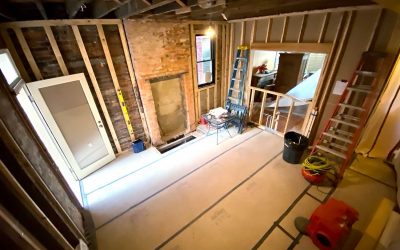
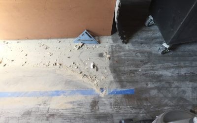
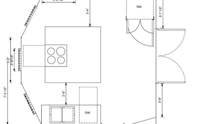
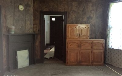
The Build: What It Actually Takes to Renovate a 1911 Kitchen
There is a version of a kitchen renovation that exists in renderings — clean lines, finishes selected, everything in its place. And then there is the version that exists before that one, where the walls are open and the floors are covered in a century’s worth of decisions that have to be undone before anything new can begin.
This is that post.
The dust
The wood paneling came off first, then the plaster and lath walls. Plaster dust is some of the finest particulate you will ever encounter in a renovation — it travels. It doesn’t stay in the room you’re working in. It finds its way into every other room, settles on every surface, and coats everything in a layer that feels almost silky until you realize it’s been three days and it’s still there.
The drywallers came in after demo. Drywall sanding dust is similarly fine, though it doesn’t travel quite as aggressively. And then came the floors.
Floor sanding dust is in a category of its own. It lands on exposed skin and pulls the moisture out of it. Face masks needed to be changed nearly every hour. A shop vac handles what it can, but the dust wins most of the time. Anyone who tells you a renovation is clean has never opened up a 110-year-old house.
What was inside the walls
Once the walls were open, the first thing that became visible was knob and tube wiring — the original electrical system, still in place throughout the house. It had been spliced into both aluminum wire and copper romex, which is among the more hazardous combinations you can find in an old home. The decision was straightforward: full rewire, the entire house, not just the kitchen.
The electricians were in the house for three weeks on the rough-in alone. Some of the kitchen wiring had to wait until after the cabinets were installed.
The HVAC was a separate project entirely. This house got a full mini-split system — individual head units in each room, fed by copper line sets running from outdoor condensing units. Installing line sets through a 1911 house means feeding two insulated copper pipes, an electrical wire, and a condensate drain line through walls built with old-growth lumber used as studs — dense, massive, and not interested in cooperating. Eight line sets total, four running through the kitchen walls.
My dad came down to help run them — four of us working simultaneously across three floors, my husband in
the crawlspace feeding lines up through the floor, our neighbour on the second floor passing them up, and my dad pulling them into the attic while I worked the main floor. We spent most of the time shouting to each other through walls thick enough to swallow the sound.
Here is a short video of me feeding a line set through a wall. It was three seconds long, but I slowed it down to show 10 seconds.
There was also a happy surprise. When the walls opened up above the fireplace mantel, the original brick was there — intact, just waiting. It stayed exposed. It’s still there.
The floors
The floors are original heart pine — old-growth, dense, narrow-grained, the kind of wood that doesn’t exist in new construction anymore. They were also cupped, which is what happens to old wood floors over time as moisture works through them unevenly, and they had adhesive from a previous surface bonded directly to them.
Getting them back meant sanding by hand — my husband, my brother, a neighbour, and me, working through the glue room by room. Heart pine at this age responds differently than newer wood — it has to be read as you go. The result was worth every hour of it. Refinished, the floors became the anchor of the room.
The trim
When the original trim came off during demo, most of it came apart in pieces. Some was salvageable. Most wasn’t. The millwork in this house — the entryway, the living room, the study — is part of what makes it what it is, and matching it convincingly matters.
A specialty wood shop had a knife profile already cut that was close enough to the original that it’s genuinely difficult to tell them apart. The new trim went in alongside what could be saved, and the room reads as continuous. That’s the goal — not perfect preservation, but seamless integration.
The finishes
The cabinet color went through its own process. White cabinets are beautiful in principle — and impractical in a kitchen where two people cook seriously and messes are part of the work. The cabinet makers produced samples based on a reference image, landing on a stain and glaze that reads somewhere between driftwood and warm grey. Neither painted nor natural. A tone that felt like it had always been in the home.
The sink configuration was a 60/40 over a standard 50/50 — larger and deeper on the main side, sized to lay a full plate flat. For a kitchen where preserving is part of the work, that matters.
The granite slab was selected in person at the supplier, which is the only way to choose stone. A slab that reads as grey and white in a sample board has movement and depth in full scale — it shifts with the light. In a kitchen with three bay windows, that’s not a small thing. The right slab was identifiable the moment I saw it. I called the supplier from the cabinet maker’s studio and asked her to hold it.
I made the floating shelves from raw ash slab — cut, sanded through multiple grits, sealed, and installed on hidden brackets myself. The kind of detail that reads as simple once it’s done, and is anything but.
Studio Olio specializes in historic home renovation in Denver and remotely. If you’re planning a kitchen renovation and want to understand what’s possible — start with a complimentary discovery call.
What should you do if you find knob and tube wiring during a historic home renovation?
It depends on the condition. Knob and tube that is unspliced and has intact insulation can, in some circumstances, be left in place — it’s the modifications that make it dangerous. In this house, the wiring had been spliced into both aluminum wire and copper romex, which is among the more hazardous combinations you can find in an old home. That made the decision straightforward: full house rewire, not just the kitchen. If the walls are already open and the wiring has been compromised, there’s no good argument for leaving it.
Can original hardwood floors be saved if they have glue or adhesive on them?
Usually yes, though it takes more work than a standard refinish. Old-growth hardwoods like heart pine are dense enough to sand through most adhesives, but cupping and uneven surfaces require reading the floor as you go rather than running a drum sander straight through. The result is nearly always worth the effort.
How do you match original trim in a historic home renovation?
Find a specialty millwork shop that can match the profile. Most historic trim was cut with specific knife profiles that a good shop can replicate from a sample of the original — or from a measurement if the original is too damaged. The goal is seamless integration, not a perfect copy of something that no longer exists.
How do you manage dust during a historic home renovation?
You manage it, but you don’t eliminate it. Plaster, drywall, and floor sanding each produce different dust with different behavior — plaster travels the farthest, floor sanding is the most physically demanding to work through. An air scrubber is worth having on site — unlike a regular fan, it pulls particulates through a HEPA filter rather than just redistributing them. Containment helps. A shop vac helps. Changing your face mask regularly helps. Accepting that everything will be coated in something fine and gritty for the duration of the project helps most of all.
Before anything gets built, there’s a period where the room exists only on paper — and the job is to find the layout that stops arguing with itself.
For this kitchen, that took five iterations before I got to two concepts worth presenting. A room with three bay windows, two single doors, a set of French doors, an original built-in, and a fireplace requires that kind of rigor. Every opening is a constraint, and constraints in a room like this compound quickly.
What the constraints were
The room is 14 by 15 feet at its widest point — generous for a Victorian kitchen, which is part of why it was the right room. But the five openings ate into that generosity fast. Every door, every window, every built-in created a zone you couldn’t put cabinetry in front of. The fireplace took a full wall section. The French doors to the living room needed clearance on both sides.
What was left, once you accounted for all of it, was two functional walls. The constraints didn’t feel like limitations once I stopped working against them — they clarified the decisions, because they eliminated most of the options.
What got decided and why
The sink wall went between the two single doors — the only run long enough to hold it. Open shelving above rather than upper cabinets, because upper cabinets in a room with this much light and this many original details would have competed with what was already there. I built the shelves from ash slab — cut, sanded, sealed, and installed on hidden brackets.
The island went in the center of the room with the cooktop built in. The orientation was deliberate: sitting at either end of the island, the bay windows are directly behind you — the light, the greenery, the shelf of plants. The island had to be shortened from the original plan — the flow from the living room to the refrigerator required it, which is something you confirm by taping the layout on the actual floor and walking every path before anything gets built.
No upper cabinets anywhere in the room. The bay windows needed a plant shelf, not cabinetry. The built-in painted black, with the botanical wallpaper — black ground, gold branches — running the full wall on either side. That wall didn’t need anything else.
The built-in
The original built-in stayed exactly where it was. The passthrough behind its doors still connects to the butler’s pantry, exactly as it was designed to do a hundred years ago. Finishes like the wallpaper are confirmed on site, once the bones are in place and the room’s character becomes clear — not on a mood board. In a historic home, the room usually tells you what it needs. This one was no different.
What a layout actually is
A floor plan is the result of knowing — knowing how people move through a kitchen, how light shifts through the day, how a room with this many constraints wants to be organized. The iterations aren’t guesswork. They’re a process of elimination that only works if you understand what you’re eliminating and why. By the time a layout gets built, the decisions have already been made. The construction just makes them permanent.
In this kitchen, the layout that worked wasn’t the most obvious one — it was the one that listened to what the room already was. Five openings, a fireplace, a built-in with a century of logic behind it. The room was already telling you what it needed. The job was to stop proposing alternatives and start paying attention.
Studio Olio specializes in historic home renovation in Denver and remotely. If you’re planning a kitchen renovation and want to understand what’s possible — start with a complimentary discovery call.
Should I keep the original built-ins in a historic home?
Almost always yes. Original millwork is the hardest thing to replicate convincingly. Removing it saves almost nothing and costs the home something it can’t get back.
What do you do when a historic room has too many openings for a functional layout?
You work with what the room gives you. In this kitchen, five openings left two usable walls — that determined everything: where the sink went, where the island went, why there are no upper cabinets. Constraints in old homes are usually solvable once you stop fighting them.
Why avoid upper cabinets in a historic kitchen renovation?
Upper cabinets work well in kitchens that need visual weight or additional storage. In a room with original millwork, significant window area, or strong architectural details, they often compete with what’s already there. Open shelving keeps the room breathing and lets the bones show.
Every contractor who walked through said the same thing. They were all wrong.
The first question every contractor asked when they walked through the home was the same: “How about we just put the kitchen where the old kitchen was?”
Every time, my answer was no.
The original kitchen was the smallest room in the home. One window. The main back entry — where you came in from the car, from the yard, from the world — opened directly into it. It was dark, it was cramped, and it sat at the back of a Folk Victorian built in 1911 that deserved better.
I knew where the kitchen needed to go the moment I walked into the room in the middle of the home.
The room that wanted to be a kitchen
Three large bay windows. Greenery outside. Light coming in that changes through the day and makes a room feel alive.
The room had almost certainly been the dining room at some point — there was a built-in passthrough directly from the walk-in pantry, which told you everything about how the home had originally been organized. Someone had understood this home once. The passthrough was staying.
There was also a fireplace. Original, like all of them in the home. Not working, but present — the kind of detail you don’t erase just because it’s inconvenient. It stayed.
And then there were the openings: three large bay windows, two single doors, and a set of French doors leading to the living room. Five openings in one room, plus a fireplace, plus a built-in. Every contractor who said no was looking at that and seeing a problem. I was looking at it and seeing a kitchen.
What made the original kitchen wrong
The size was wrong. One window in a home full of light is a waste. But neither of those was the real problem.
Victorian kitchens were never meant to be seen. They were back-of-house by design — separated from guests, separated from family rooms, tucked away from everything that constituted the presentation of the home. The kitchen was a workspace. It produced heat, smell, noise, and mess, and the entire floor plan was organized to keep all of that invisible.
The butler’s pantry was the pressure valve. It sat between the kitchen and the dining room and did several things at once: it staged meals before they were presented, stored china and silver and linens, and kept the chaos of the kitchen completely hidden from anyone sitting at the dining table. Food moved through it quietly, in an organized way, without the dining experience ever touching the work that produced it.
The back stairs did the same thing for movement. Whoever was running the household could move between floors without using the main staircase. Supplies went up, laundry came down, and the front of the home stayed calm. Two parallel systems: one for living, one for running the home. The layout wasn’t decorative. It was functional logic.
By the time I bought this home, the staff were long gone — but the bones remained. The butler’s pantry was still there, tucked under the rear staircase, with shelves on each side and a large window. The passthrough was still there, connecting it directly to the room that would become the kitchen. The rear staircase was still there, but it no longer worked for modern living.
Moving the kitchen corrected that. The old kitchen became what a back-entry room with a parking-side door actually wants to be: laundry, mud room, tool storage. The home didn’t lose a room. It gained two.
The decision
Moving a kitchen in a historic home means new plumbing, new electrical, new ventilation — all of it relocated, all of it permitted. Every contractor saw the cost and the complexity and suggested the path of least resistance.
But the path of least resistance would have left the smallest, darkest room in the home doing the heaviest daily work, while the room with three bay windows and an original fireplace sat there being something lesser. That’s not a renovation. That’s just moving furniture around inside a problem.
What it became
The island and the bay windows became the anchor of the room — the kind of place where you sit down with coffee and don’t leave. I could watch the birds out those windows for hours. The flow worked. The storage worked, especially once the butler’s pantry found its home under the second staircase — but that’s the next post.
This renovation made something clear to me that I haven’t stopped believing since: historic homes already know how they want to be organized. The logic is in the bones. The job isn’t to impose a new plan — it’s to find the one that was always there.
That’s why I do this work.
—
Studio Olio specializes in historic home renovation in Denver and remotely. If you’re planning a kitchen renovation and want to understand what’s possible — start with a complimentary discovery call.
Yes — though it means relocating plumbing, electrical, and ventilation, all permitted. The question isn’t whether it’s possible, it’s whether the original layout is actually serving the home. Often it isn’t.
Will moving a kitchen hurt the historic character of the home?
Not if it’s done with the original logic in mind. In this case, moving the kitchen restored the home closer to how it was meant to function — the back room returned to a service entry, the kitchen moved to where the light was.
How do I know if my kitchen is in the wrong room?
Start with how the room feels to use every day. If the entry, the light, or the flow feels wrong, it usually is. Most historic homes have a logic to them — sometimes the kitchen just ended up in the wrong place over time.
If you’ve spent any time researching what to do with an older home, you’ve probably seen these words used interchangeably: preservation, restoration, renovation, rehabilitation. They’re not the same thing. The approach you choose shapes every decision that follows — who you hire, what you keep, what you change, and how much it costs.
Here’s how to tell them apart.
Historic Preservation
Preservation is the most protective stance you can take with a historic property. The goal is to maintain what exists — original materials, original finishes, original form — with as little intervention as possible. Repair rather than replace. Stabilize rather than improve.
In practice, preservation is often legally defined. If your home sits within a historic district or carries a landmark designation, certain changes require approval, and some are off the table entirely. Denver has several locally designated historic districts — Potter-Lawson, Curtis Park, and Country Club among them — where exterior alterations go through a review process before a permit is issued.
Even without a legal designation, preservation is the right framework when a property has significant architectural or cultural integrity that would be diminished by change. The question isn’t can we update this — it’s should we.
Historic Restoration
Restoration takes a specific moment in time as its target. The goal is to return a property to how it looked and functioned during its most historically significant period — which often means removing things that later owners added and aren’t original to the house.
That drop ceiling in the dining room. The aluminum siding someone installed in the 1970s. The replacement windows that don’t match the profile of the originals. Restoration work pulls those layers back and works from what’s underneath.
This is exacting work. It requires research — historic photographs, Sanborn fire maps, paint analysis, original permit records — to establish what “original” actually looked like. It’s also the approach most likely to involve period-appropriate materials and craft techniques that aren’t easy to source.
Restoration makes the most sense when a home’s historic integrity is largely intact and the goal is to recover what’s there, not reimagine it.
Historic Renovation
This is where most of Studio Olio’s work lives.
Historic renovation keeps the character of an old house — its proportions, its architectural logic, its materials — while updating it to function well for the people who live in it now. New systems. Code-compliant electrical. A kitchen that works. A bathroom that doesn’t require a history degree to operate.
The discipline is in knowing what to touch and what to leave alone. Original millwork, old-growth fir floors, plaster walls with good bones, built-ins that have survived a hundred years of use — those stay. A non-original partition wall, a bathroom addition from the 1960s with no relationship to the rest of the house, a layout that makes the home genuinely hard to live in — those are candidates for change.
Studio Olio is currently working in Curtis Park — one of Denver’s oldest intact neighborhoods — where nearly every block has a home worth getting right.
Historic renovation is not about making an old house look old. It’s about making an old house work — without erasing the reason it was worth keeping.
Rehab (Without the Historic Consideration)
Rehab, in the conventional sense, means bringing a property up to livable or marketable condition. There’s nothing wrong with that goal. But when it’s applied to historic homes without any regard for what made them worth saving, the results tend to be the same everywhere: original details stripped out, surfaces covered in materials that have no relationship to the house’s era or character, front porches enclosed to add square footage.
The house still stands. But the thing that made it irreplaceable is gone.
Denver loses historic fabric this way more often than it should. It’s usually not malicious — it’s a cost calculation made without full information about what was there or what it was worth.
Which Approach Is Right for Your Home?
The answer depends on your home’s condition, its designation status, your goals for the space, and — honestly — how much of its original character is still intact. Most historic homes in Denver that haven’t been landmarked sit somewhere in the renovation category: enough original fabric to be worth protecting, enough that needs updating to require real decisions.
That’s exactly the kind of project Studio Olio was built for. If your home was built before 1960 and you’re trying to figure out what to keep and what to change, that’s where we start.
I’ve said that out loud more than once since this project wrapped, and I mean it. Not because it’s the most dramatic renovation I’ve ever done, but because of what it took to get there — and because of how completely it changed a room that had almost nothing going for it.
Almost.
The footprint is 6 feet by 6 feet. The walls had mold. The plaster was cracked. A soffit above the sink was eating into the headroom, making the space feel even more closed-in than it already was. Storage was nearly nonexistent.
But there was a large window, and morning light came through it like the room was asking for something better. And there was a cast iron tub with 1913 stamped on the bottom.
We built around both.
What We Were Working With
This is a full gut renovation — down to the studs — in a Victorian-era home in Richmond, Virginia. We didn’t move any plumbing. Because we were already opening up the space downstairs, moving things around was on the table — we even looked at pulling the tub in front of the window. In the end we left everything where it was. A freestanding tub in front of a window looks beautiful in photos and is a pain to keep clean in real life. The tub, toilet, and sink stayed put.
What the room needed wasn’t a different layout. It needed storage, light, and a design that could hold its own in a house with this much history — without overwhelming a space the size of a generous closet.
The brass shower surround and the original faucet were worth keeping. We cleaned them up and brought them back.
The Client Brief: Pattern, Contrast, and a Nod to France
The black and white palette wasn’t a mood board decision — it came from the floor. The original hex tile was already there, already black and white, already saying something. That’s where the direction started.
The client had also spent time living in France and wanted something of that feeling brought forward — not as a literal reference, but as a sensibility. Classic contrast. Pattern with intention. A bathroom that felt personal rather than just renovated.
Both things pointed the same way. Victorian interiors layered pattern; they committed to it. They weren’t afraid of a small room with a strong opinion. The original hex tile was already making that argument. We listened to it.
What Changed
The tub was refinished — grey on the exterior, white inside — and we enlarged the original surround. A cast iron tub from 1913 has a weight and depth that a new one can’t touch.
The vanity was custom designed and built to fit the room exactly. It quadrupled the storage the bathroom had before. By wall-mounting the faucet, we freed up enough counter space for an artist-edition sink — the kind of piece that changes the feeling of a room the moment you walk in.
The walls are black and white diamond-patterned tile — graphic and committed, the kind of move that only works if you go all the way with it. The original hex floor anchors everything below, the thread that ties the old room to the new one.
The soffit above the sink came out, and the room exhaled.
Thirty-six square feet. It doesn’t sound like much. But a room this considered doesn’t need to be large.
Before
After
BEFORE
After
On Renovating Victorian Bathrooms in Denver
Denver has a lot of houses built between 1880 and 1920, and their bathrooms share a few things: small footprints, original plumbing that wasn’t designed to be moved, walls that have absorbed a century of moisture, and details worth keeping if you know what you’re looking at.
The instinct in a bathroom like this is often to gut everything and start fresh. Sometimes that’s right. But a 1913 tub in good structural condition isn’t a liability — it’s the best thing in the room. The work is figuring out what the house is trying to be, and building around that rather than over it.
That’s what historic home renovation in Denver actually looks like in practice.
The build — the custom vanity construction, the mold remediation, and what it actually takes to work inside a footprint this size — is covered in Part 2, coming soon.
This is part 2, of this Historic Church Hill, Richmond, Va project build, check out part 1 here.
Now that the fence, and two custom structures are in place, the grading of the site can continue and the hardscaping can start!
As the property is on a small slope I divided the design into three separate grades. The back area where the shed is and the portion where the clients step out is 18″ above the grade of the patio. We used a small brick wall to retain the upper portion, with a slight slope leading to the ramp, where the bottom of the ramp below the patio grade by 15″.
Here you can see the footer dug out for the wall that supports the patio and creates the edge of the ramp.
The homeowners and I decided on a ramp over stairs to deal with the elevation change. Partly because the awkward step that was there previously had really aggravated them and if they are using a dolly to load items from the shed, stairs would have been manageable, but still an irritant. Yes, dear readers, all things that bother you should be considered in a functional design.
Other pro’s to having a ramp vs stairs are:
Accessibility. While this wasn’t a consideration for these clients, being able to navigate small areas with a walker, cane, or wheelchair may be a huge plus for a future occupant, many years down the line.
Safety. Ramps are safer than stairs for people and dogs!
Here are the footers after they have been poured. And below, the stair foundation where the bricks get laid.
The walls are starting to take shape.
The patio under the pergola is now nearly finished.
The side lower patio/walkway got installed next. Below we are deciding how to make the garden bed edges look perfectly square, when the neighbours house is not parallel to the clients home. A completely normal issue to have, especially when working with 100+ year old homes.
Success!!
Next, all the garden beds had 18″ of soil removed so we could install soil filled with nutrients and compost.
The photo below shows the results from the “Soil Jar Test” from various places in the yard to find out the soil composition of each garden area. The soil separates and lets us see how much sand, silt, clay, loam and organic matter is in each sample. The jar on the far left has the clearest water and the least amount of organic matter. The jar in the middle has the most organic matter and the one on the right had between the other two.
The conclusion: the existing soil composition had high amounts of sand, which is great for drainage, but terrible for retaining moisture and nutrients. The organic matter in the soil was hardly evident.
When soil has 50% organic matter, or compost, it retains the moisture nutrients in a far more efficient manner which helps all the plants be the healthiest they can be.
Now on to the part that is the most rewarding personally!! The plantings! Plants bring a multitude of benefits; privacy, they change the look and feel of the property, they bring butterflies, bees (good ones), and birds. They add scent, colour and an overall softness to the space.
Since we removed some of the mature trees that had become problematic because they were oversized for the space, I chose three trees that would be spring flowering and stay compact, so that in 10-20 years they won’t have to be removed.
This first one had a monster sized root ball. The tree dolly wouldn’t fit through the gate, so we had to use a regular dolly and three people to manhandle it in place. Always start with the hardest item first, right?
Next we brought in the yew hedging. For context here is ONE beside the pergola. My grower told me they would be 160lbs each. The best guess from my planter is that they were 300 lbs each. Big and Beautiful!
Large yew hedge = instant privacy!
Once the yew hedging was in, we were able to complete the final grade. One of the clients requests was that she be able to walk out of her shed with a large step. We used metal mesh to block out any areas under the gravel so groundhogs and other pests won’t be able to create a den and cause future problems!
Here is a birdseye view of the other plantings starting to be laid out.
And a quick catch up on the front:
Remember the large stack of bricks that came out of the back yard? The masons reused them and we stuck to the historic guidelines and laid them in a herringbone pattern to match the sidewalk and edged them in granite cobbles to complement the historic granite curbs!
Here is what the plant layout looks like before going in the ground.
This is what blooms in June through July!
Cranesbill, Geranium
Hydrangea; saved from client original garden
Liatris
Yarrow
Next the neighbours painted their house, while the cushions and mosquito curtains got made and hemmed, and finally we have the final images to share!
In the before photo’s you may remember the pea gravel walkway and the ladder and hoses laying on the ground. Below you can see the ladder got mounted on the wall, the old hose reel got replaced with a smooth gliding one and now the trash and recycling cans can be taken out to the curb with ease.
As you walk down the side of the home, you come into this side courtyard, that has screening for the trash and recycling and leads up the ramp to the shed, or over to the patio area.
Above is a birds eye view from the clients roof!
Can you imagine yourself sitting here in peace, watching the birds fly into the trees, the butterflies floating around the flowers and your dog lying on his ottoman?
We only have one design spot left for the early new year, so if you were hoping to have a design and build for spring, contact me now to save your spot!!
Tell me below, dear readers, what was your favourite element of this project? Did anything surprise or delight you? AND BONUS — how many (amazing) people did it take to complete this build? Let me know your best guess below!