
This Victorian home renovation began with understanding why the additions never quite belonged.
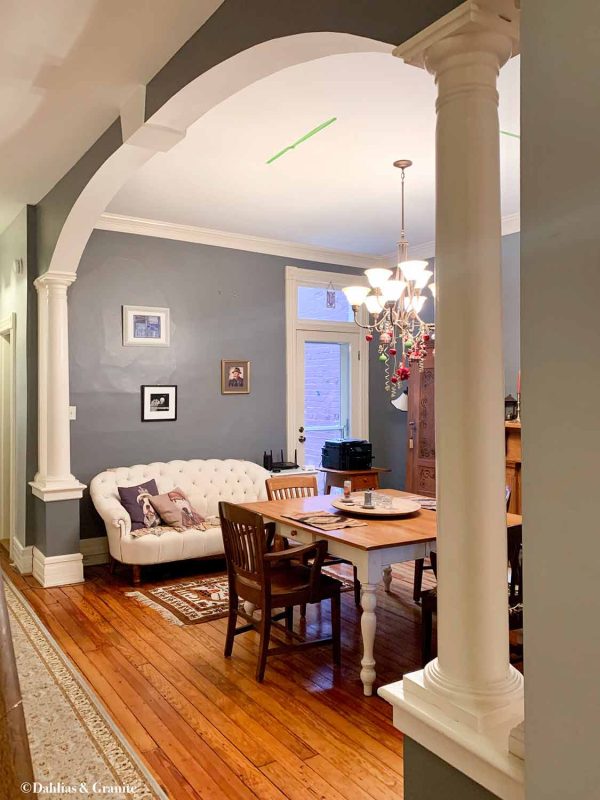
An 1889 Victorian home in Richmond’s Church Hill neighborhood had everything going for it — ten-foot ceilings, intact millwork, and a layout that still largely made sense — except for the columns and arch someone installed in the dining room in the 1990s.
There is a particular kind of renovation mistake that is easy to understand in the moment and hard to live with over time — the kind where someone looks at a room that already works and decides it needs more presence, more definition, more architectural detail, without fully considering what that addition is going to do to the space as a whole.
The 1990s were full of this kind of thinking, and the dining room of this 1889 Victorian had been living with the consequences for decades by the time Studio Olio came on board: a pair of decorative columns and a plaster arch, installed purely for effect, cutting straight across a room that had been generous and well-proportioned before they were installed.
What you were walking into felt smaller than it should have.
The ceilings were ten feet. The original millwork was intact. The bones were good. But decades of accumulated decisions — paint layered over paint, rooms adjusted and added to — made the house feel compressed in a way that its proportions didn’t warrant.
The homeowner knew this. She had already completed two renovations before we came on board, and she had done them carefully, working within Richmond’s historic district guidelines and understanding what it means to be a steward of a house like this. She simply didn’t want to go through the certification process again for this scope of work, and she didn’t need to.

The original kitchen, meanwhile, had spent those same decades in the back of the home, in an 11-by-11-foot room with a back door, two east-facing windows, and just enough space to function as a 19th-century service kitchen. Previously renovated in the 2000’s.
As a Victorian kitchen, it made a certain kind of sense — these rooms were designed to be out of sight, kept at the back of the house where the work of cooking could happen away from the rooms where guests were received.
As a 21st-century kitchen for a homeowner who bakes, whose husband cooks occasionally, and who entertains when the mood strikes, it didn’t work at all.

Moving the kitchen wasn’t a small decision in this Victorian home renovation (you can see how that unfolded in the next phase of the renovation), but it was a clear one, because the dining room sat at the center of the home with the ceiling height, the proportions, the light, and the connection to the rest of the house that a kitchen actually needs to function the way people live now.
We stood in the dining room before the renovation and felt the columns’ weight before you fully register them — the sense that the room is narrower than it should be, that the ceiling is farther away than the walls suggest, that there is something slightly off about the proportions that you can’t quite name until you look up and see the arch.
At a glance, the columns and arch almost worked, because they were referencing something classical, but the longer you stood in the room, the more it became clear that they weren’t speaking the same language as the house — or even to each other.
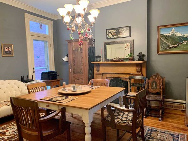
Victorian dining rooms were designed with specific dimensions in mind: wide enough to hold a table for a full family with room to move around it, proportioned to connect to the kitchen and butler’s pantry without either being visible to guests, tall enough to feel generous without feeling cold. The underlying logic of the room was still there.
What had changed was how it was being read.
The additions weren’t structural, which meant the arch and columns were introducing visual weight without doing any of the work that would justify it, and in doing so, they divided a room that had originally been meant to read as a single, well-proportioned space into something that felt narrower, shorter, and more constrained than it actually was.
The columns suggested one idea, the arch another, and the keystone layered on a third, so instead of reinforcing the architecture that was already there, they flattened it into something more generic, where the room lost the specificity it would have had in 1889.

The columns (also called colonnades) themselves weren’t entirely without precedent — by the late Victorian period you do start to see classical columns used to define transitions between rooms — but the arch was the giveaway.
An 1889 Victorian would have had rectangular cased openings with substantial trim, or at most a shallow segmental arch, not this kind of continuous rounded plaster form spanning between columns. That arch belonged to a different conversation entirely.
And then there was the keystone — a detail that only makes structural sense in a true masonry arch, where it is actually holding something in place. Here it was purely decorative, pulling from yet another architectural language: Georgian, Federal, Colonial.
Victorian columns, Mediterranean arch, Colonial keystone — three dialects in one opening, none of them quite right for an 1889 Church Hill brick Victorian, and all of them competing for attention in a room that had never needed any of it.
What the 1990s renovation was trying to do is easy enough to understand: break up a long sightline, add perceived grandeur, soften the transition between rooms. These are legitimate instincts. The execution just had no clear anchor, and the room had been living with the consequences ever since.
Why the Dining Room Needed to Change

Once we decided that the kitchen would move forward, the columns and arch stopped being a stylistic issue and became a functional one — they interrupted sightlines, constrained circulation, and turned what needed to be a working room into something that felt staged. They framed the wrong moment.
So they came out — not as a dramatic gesture, but more like an apology to the room.
Stripping that whole assembly out — the columns, the arch, the keystone — eliminated a false focal point, simplified the sightline, and gave the room back its proportions. Not as something decorated, but as something proportioned.
When does a 90s renovation do more harm than good to a historic home?
When it adds detail that competes with what’s already there rather than working with it. Victorian homes have an internal architectural logic — proportions, trim profiles, room relationships — that was developed over decades of building practice and refined to a high degree by the late 1800s.
A renovation that layers new decorative elements on top of that logic usually ends up fighting it, and the rooms feel it. The columns and arch in this dining room are a good example: they were trying to add presence to a room that already had more than enough.
Is it always worth removing a non-original addition in a historic home?
Not always — some later additions integrate well enough that removal would create more disruption than it solves. But when an addition is clearly at odds with the original room’s proportions and function, removal is almost always the right answer. The question worth asking is whether the addition belongs to the house or belongs to a particular moment in time that the house has long since outlasted.
What happens to the original kitchen space when the kitchen moves in a historic renovation?
It depends entirely on what that room was and what it was built to do. In this home, the original back kitchen had a back door, east-facing windows, and direct access to the yard — the exact right conditions for a plant room, a workout space, a sunny spot for the cats. Moving the kitchen didn’t leave a problem behind. It left a room that finally made sense.
Studio Olio specializes in historic home renovation in Denver and remotely. If you’re planning a kitchen renovation and want to understand what’s possible — let’s talk.
Project Journal
Every historic renovation has a story. The story of this Victorian kitchen renovation unfolds across three journal entries:
Why the Kitchen Moved – – (current article)
Understanding what wasn’t working and why the dining room became the new kitchen.
Relocating a Kitchen in a Historic Home
The structural, masonry, and millwork work required to make the move possible.
Victorian Kitchen Renovation: The Finished Space
The completed kitchen and the details that make it feel as though it has always belonged.

